
Aurum Assessoria
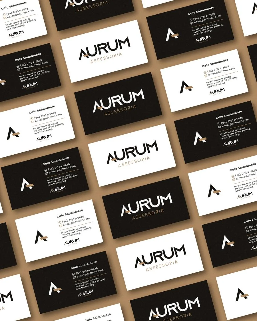
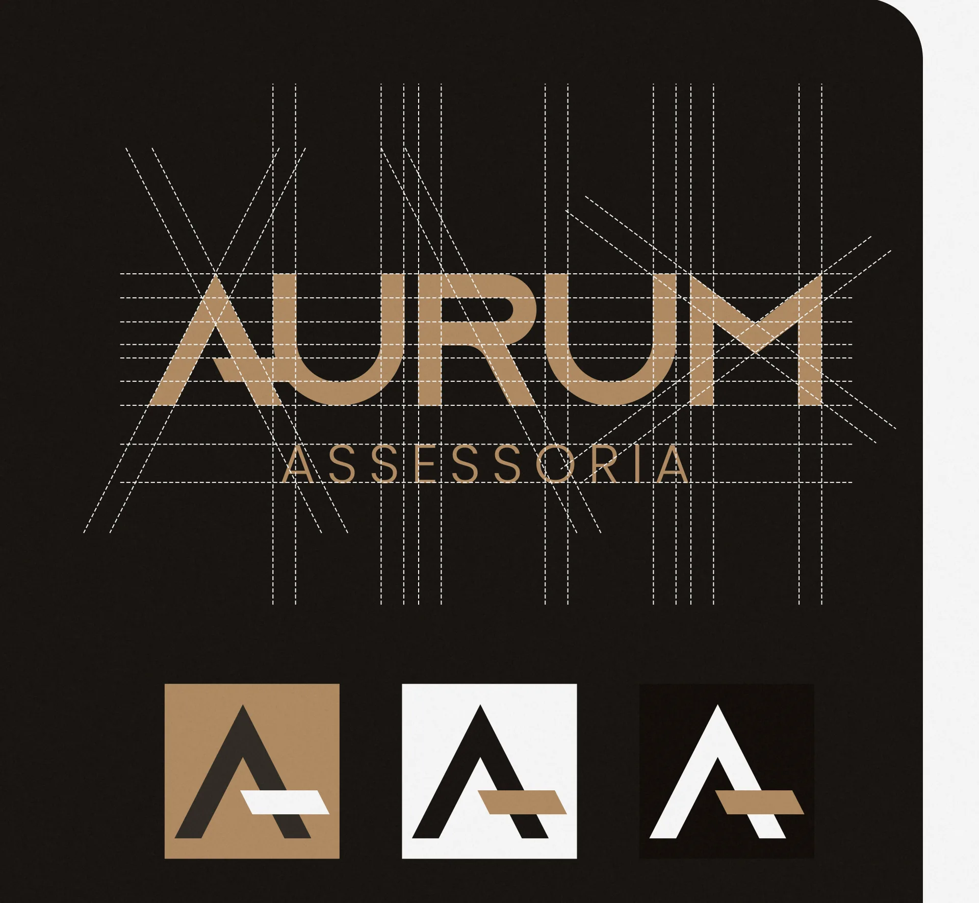
Aurum helps individuals and families organize their finances with peace of mind. The challenge was to create a visual identity that conveys exactly that: trust, organization and financial growth.
- Industry
- Logo · Investments · Finance
- Scope of work
Process
Aurum AssessoriaCreative direction
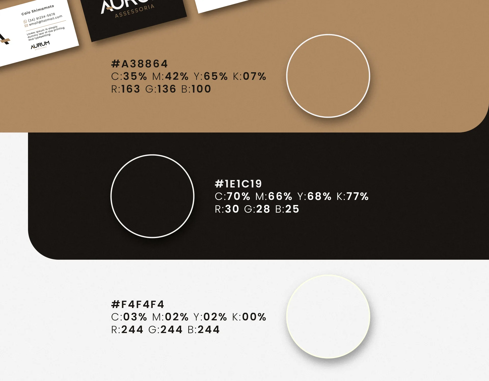
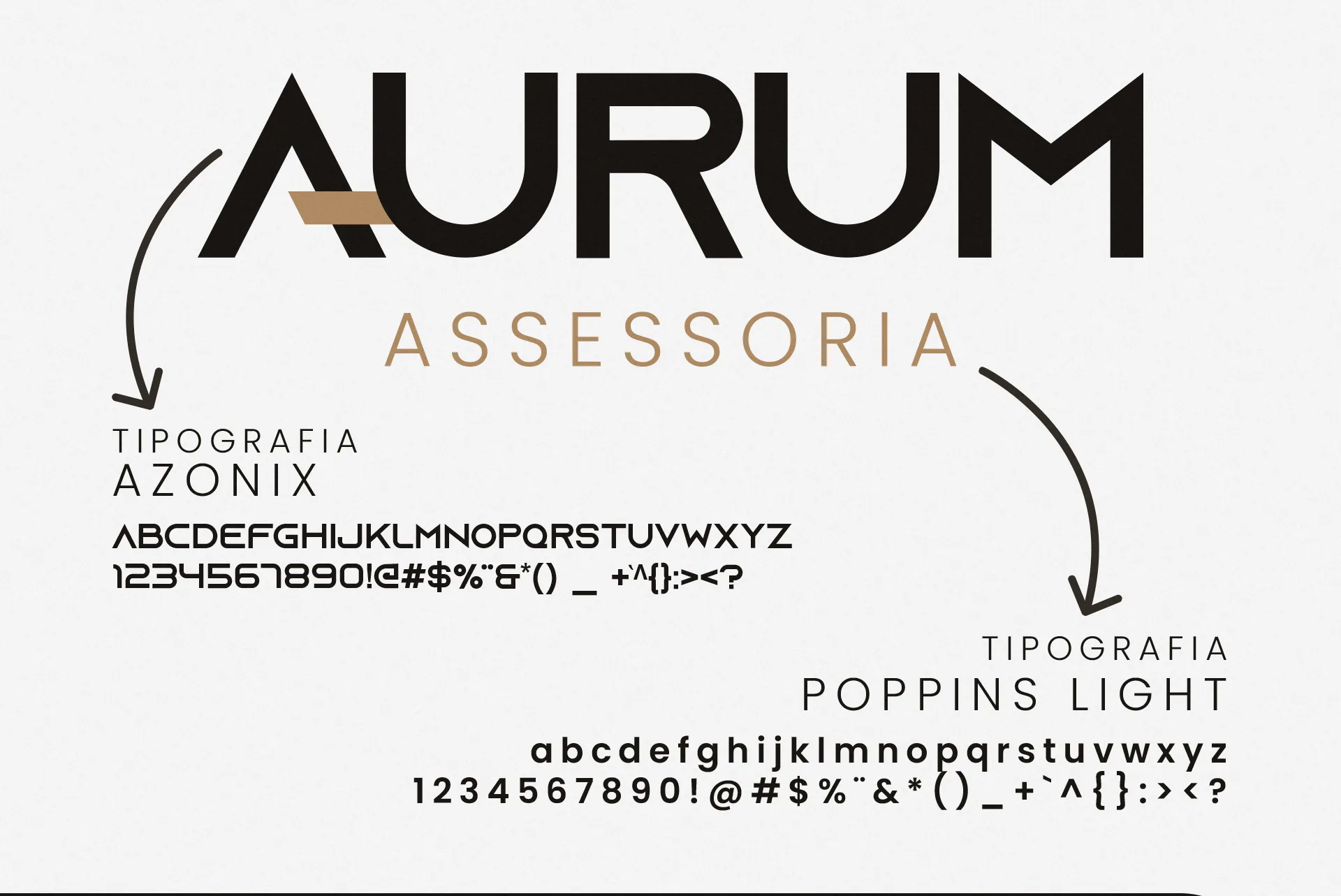
Inspired by the Latin word for gold (Aurum), the brand rests on three pillars: organization, protection and growth. The look combines sober tones with gold details and a geometric typeface, creating an elegant, well-structured visual.
Development
We started with in-depth market research and hands-on tests of typography and applications. Every detail was considered to keep the brand consistent and reinforce the firm's credibility.
Result
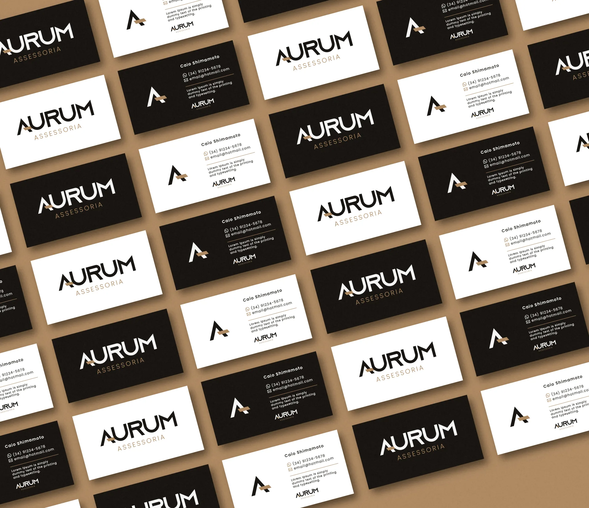
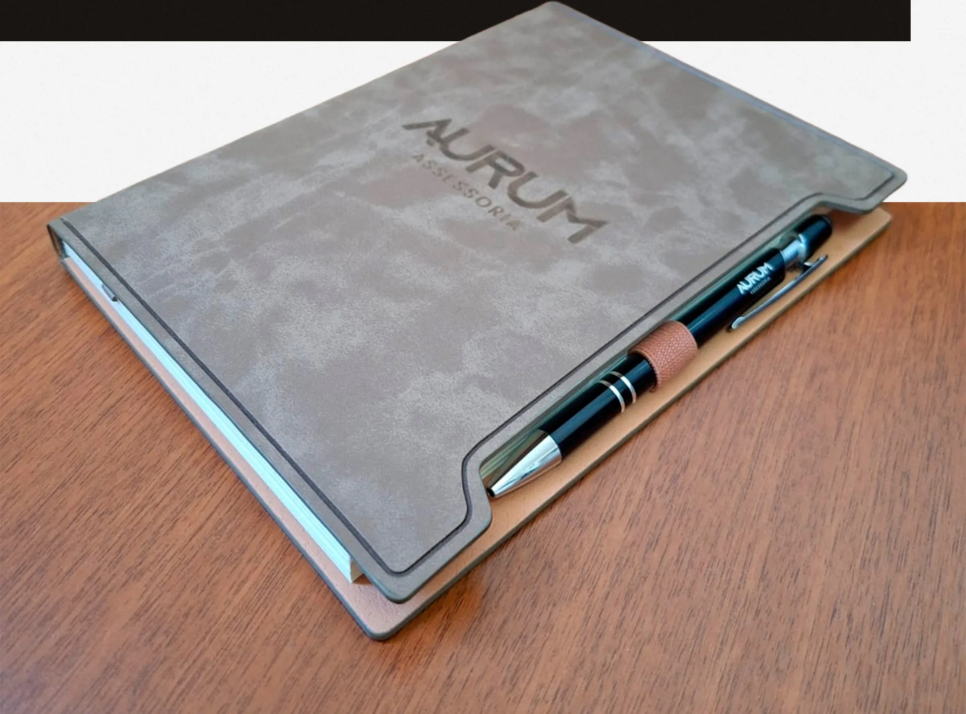
The new identity came to life on business cards, stationery and corporate materials, consolidating Aurum's professional image and bringing the brand closer to its audience.